
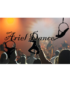
For this project I created a a poster. For this project I wanted to show a type of fitness that isn’t seen in every day life. For this poster I wanted to introduce lyra, also known as aerial hoop. The posters of Cirque du Soleil were an inspiration for my work. My goal with the crowd and bright lights was to express excitement for the models in the foreground. The process I used was to find a suitable background and then used the magic lasso tool to outline the models then filled them in black. I collected the photos of the models from pictures I had of myself doing lyra while I found the background on Pixabay. I found it challenging to outline the circles of the lyra hoop without forming jagged edges with the magic lasso. being detailed with my work was the most effective work around I could find.
Pixabay, (2006). Web. September 14, 2018.
https://pixabay.com/en/audience-concert-music-868074/

This design is impressive and clearly captures the goal of your blog. I like that it focuses on a form of exercise that is unique and not just running or weights, etc. I didn’t even know what lyra was before seeing your blog. The way you filled the silhouette of the dancer in black is a strong touch that portrays lyra as mysterious and elegant, as well as allowing the viewer to envision themselves as the dancer. It conveys the message that anyone can do lyra if they are willing to put in hard work. In order to enhance your design even more, I recommend retracing the outlines of the dancers to make them smoother. If you didn’t use the zoom in tool to do that, you should try it. You could also use the rule of threes to make the three dancers aligned in a more diagonal line across the poster. This would look more consistent and would flow better. You could move the text into a different corner and it would most likely all fit. This design has a lot of potential and could be even better with slight improvements.
LikeLike
Overall I really like the theme that you have picked here. It is very unique and I can also tell that it is something personal and important to you. I like that the Ariel artists are blacked out creating just a silhouette of the people, I have always seen that as a cool technique! It allows you to focus on their body positions and not their outfits or face. It also allows you to create a designed background like you did. I also find the general color scheme to be very appealing and a good choice for your theme. Moving on to tips, I feel as though some improvements could be made to the placement of your pieces. Strategic placement of each item would make some of your components more appealing and easier to see. I love the color choices, but the Ariel artists bodies in the middle and left side kind of blend in with the dark figures of the audience. This is because they are both dark in color and layered over each other. This ends up making it hard to see the specific position the dancer on the left side in particular is in. Additionally, I believe the word “Ariel Dance” could be positioned higher on the page to stand out better against the background, it seems slightly squeezed together. I really enjoy your piece and I believe a few adjustments can make it even more great!
LikeLike
Hi Sloane! This is fascinating to me! I have never seen someone do this as a way to workout. It is intriguing and makes me want to learn more about your topic and Ariel Dance in general. I like your idea of having the crowd and bright lights to show excitement and people having fun. The designs of the people doing ariel dance shows the viewers what the crowd is excited about. I do think the text “Ariel Dance” is kinda hard to read so maybe a different color or font or moving it in a different place on the picture would help make it easier to read. It is also hard to see the ariel dancer on the bottom left corner of the picture so again maybe lightening it up or moving it to a different spot would make it much easier to see! Overall, this makes me want to learn more about Ariel dance!
LikeLike
First of all I want to start with the fact that I think this is a really cool idea. It is very original and takes a common topic to a new level by thinking outside of the box. When people think of fitness blogs they usually think of running or weightlifting so I think that this is a really solid idea for a blog because it defies the norms of what people consider fitness. The first thing that I would suggest you change is the font. I feel as though the squiggles in the font make it kind of hard to read what it says. I also think that it makes the text look like it is stretched too far because the font itself makes it looks pixelated. Also, I would try feathering the outlines of the dancers and the lettering because you can tell that it sticks out from the background. I think the design is already strong in that the background looks really good and fits the theme, and the fact that the dancers are touching the letters is a nice touch.
LikeLike
After reading through the comments, I think retracing my outlines to make them a bit clearer would be beneficial to my project. It also believe moving the wording a little higher so that it doesn’t blend into the background would be good. Most importantly, I think I should more the outline from the bottom left to a different place in the picture because it blends a bit too much into the background, making it difficult to see where the crowd ends and the outline begins. For a thought of my own, although generally accepted by my peers, I think it would be a good idea to move the bottom two dancers away from the text. I had intended to make it look as though the aerial hoops were hanging from the text, but I don’t think I was able to get that idea across very well. For a final thought, I realized—although no one else did—that I spelled Aerial Dance as Ariel Dance, and so fixing that mistake will be first priority before when creating the final draft.
LikeLike