Draft-LogoFor this project, I decided to create a Logo of using my stiletto pole heels. My course topic is unique styles of fitness. I pole dance, but I also teach pole dancing for UREC, and part of pole dancing can include different styles of shoes, such as sneakers, cowboy boots, stilettos, and ballet point shoes. I typically dance either barefoot or in stilettos. Past that, FitFlow is the name I chose for my website, so I felt it should be included in the logo.

My influences for my design were actually pole clothing brands. I was looking for pole clothing, and notices the logo for Dragonfly pole wear is a dragonfly, the logo for Bad Kitty is the outline of a cat, and the logo for Cleo the Hurricane is a lightning bolt. All of those brands contributes to my idea, which helped to create my idea. The significance of each element in my design was the stiletto which represented pole dancing, another unique kind of fitness, FitFlow is the name of my website, and the outside circle encapsulated the rest of the design.

I took a picture of my heel and uploaded it to my computer, then I sent it to my email so that I could download it for my logo. From there I placed the image in Illustrator, and used to pen tool to outline the stiletto and then cut out the little individual pieces in the strap on the shoe. After I adjusted the lines a little using the point selector tool to make sure the lines followed the shoe properly. Then I used the shape builder tool to remove the pieces near the strap that weren’t part of the shoe. I then created to colors in the swatch section and used them with the gradient tool to create the coloring of the shoe.

For the circle on the outside, I placed down two circles. One I filled with white and the other with black. I sized the black circle to be larger than the white circle, and then placed the white circle on top of the black circle by going to Object- Arrange- Send to Front. After they were on top of each other, I went back to the black circle and used the same colors I had chosen for the shoe to tie the two pieces there.

For the font, I used an Edwardian font style that was already preexisting on Illustrator to type FitFlow. I resized the text to be 72 pt font, and placed in inside the circle. I highlighted the text and created another color with the swatch maker to find a color I felt would pop more than black.

I encountered very few technical challenges while creating my logo. I had a little trouble remembering which tools did what, so I ended up re-watching parts of the Illustrator tutorial videos for help. My largest technical difficulty was that the Adobe Illustrator 2018 doesn’t already have the tools lined up on the side of the screen like it did in the videos. I was able to find all of the tools in under Window at the top of the screen and then drag them into the side bar as needed.


Final Graphic Design Project

Lyra poster

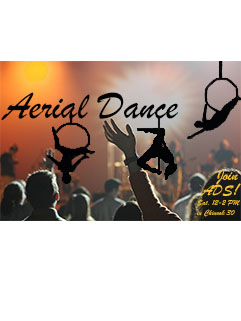
I created an Aerial Dance poster. Aerial dance is a large part of my life right now, and so I wanted to show an aspect of it.  Aerial dance has three popular categories to it: lyra, pole dancing, and silks. The poster features outlines of myself doing Lyra, also known as aerial hoop. I created the poster by taking three photos of myself doing lyra. For each picture, I used the magic lasso tool and outlined my body and the hoop. I then took the paint bucket tool and filled in the finished result with black after using the magic lasso tool. The next step was to make sure all of the blacks matched, so I used the tool that looks like an eye dropper to get the exact shade of black and adjust the color of each outline. I created the text box for “Arial Dance”, later corrected to “Aerial Dance” for proper spelling, and aligned it with one of the dancer outlines. Then I moved the other two dancer outlines to fit underneath the text, as though they were hanging from the letters. I struggled to find a background that I liked, but eventually settled on a picture of an audience that I found on Pixabay. The link for this picture on the website is listed below.

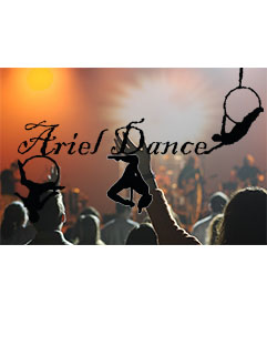
My peers suggested that I move the lettering to a lighter area in the photo and choose another lettering style altogether because the one I initially picked was hard to read. Another suggestion they mentioned was to move the bottom left dancer out of the crowd so that it could stand out a bit more. They also suggested just readjusting the dancers altogether so that they looked more evenly placed on the poster. The final suggestion given said to add more text and clear up the lines around the dancer outlines because they were a little blurry and imperfect.

In order to revise the poster after receiving feedback, I separated out the layers and redrew the dancer outlines using the brush tool and eraser tool to cleam up the lines of the dancers. I then changed the text for “Aerial Dance” to one that was more fluid and easy to read, and respelled Aerial to be correct. Next, I moved the text higher on the poster and readjusted the dancers to fit around it. For two of the dancer outlines, I used the brush tool to add in the “chain” portion  at the top of the hoop that I had initially cut out. I placed the dancer outlines underneath the letter as though it was hanging from the text. Finally I added in text at the bottom right-hand side of the poster, as suggested, to let the viewers know that they could “Join ADS”, known as the Aerial Dance Society. “Meetings are Saturdays, 12-2 pm in Chinook 30”. This club really does meet at that day, time, and location. I am an instructor for ADS.

Pixabay, (2006). Web. September 14, 2018.

https://pixabay.com/en/audience-concert-music-868074/

Graphic Design Draft

Lyra Draft

For this project I created a a poster. For this project I wanted to show a type of fitness that isn’t seen in every day life. For this poster I wanted to introduce lyra, also known as aerial hoop. The posters of Cirque du Soleil were an inspiration for my work. My goal with the crowd and bright lights was to express excitement for the models in the foreground. The process I used was to find a suitable background and then used the magic lasso tool to outline the models then filled them in black. I collected the photos of the models from pictures I had of myself doing lyra while I found the background on Pixabay. I found it challenging to outline the circles of the lyra hoop without forming jagged edges with the magic lasso. being detailed with my work was the most effective work around I could find.

Pixabay, (2006). Web. September 14, 2018.

https://pixabay.com/en/audience-concert-music-868074/


Create a free website or blog at WordPress.com.

Up ↑

Design a site like this with WordPress.com
Get started