Audio Story Draft

For my audio story I decided to focus on my journey into fitness and into aerial dance. I told an abbreviated version of how the whole journey began. My website is designed around the idea of unique styles of fitness, so I thought it would be appropriate to focus on how I found an interest in unique style and what its effect has been on my life.\

My research focused on finding the right kind of music to play while I was talking during my story, and I found the one I wanted to use off of freesound.org, which is licensed under the creative commons 0 license. The free sound I found was the emotional piano bu tictac9. Link found below:

https://freesound.org/people/tictac9/sounds/443344/

My technical process was to record myself saying my story. There were initially a couple of ‘um’s and ‘uh’s in the recording and a couple pauses were I wasn’t sure how to phrase what I was saying. I placed the audio track into audition and started with the cut tool. I shorted the silence at the beginning and end of the recording. I then cut out any awkward pauses and all of my ums and uhs. After I removed a small section of the recording because I no longer felt it was relevant by time I had started editing the recording. I then used the select tool to drag all of the clipped pieces together and see if they would fit. I had to re-cut a couple portions after that because it didn’t line up perfectly.

After I was finished with my voice recording, I found a song to pair it with from freesound.org and placed it in audition. I muted my voice recording and started with the cut tool. I removed the beginning and end of the sound a little, and then I tried to removed the middle of the track because it created a lull where my story didn’t have one. I removed it, but then had to add back in section because my clip wasn’t long enough, so I made a duplicate of the rhythm by cutting and lengthening the sound track pieces until it all fit together to be long enough from my voice recording. I adjusted the sound volume down as well with the sound clip because it was overpowering my voice.

Raw Audio Footage


I decided to go with the story of how I discovered pole, how I worked for it, and what pole has done both to me and for me.

Logo Project

Logo-Final-JPEG

For this project, I decided to create a Logo of using my stiletto pole heels. My course topic is unique styles of fitness. I pole dance, but I also teach pole dancing for UREC, and part of pole dancing can include different styles of shoes, such as sneakers, cowboy boots, stilettos, and ballet point shoes. I typically dance either barefoot or in stilettos. FitFlow is the name of my website, so I felt it should be included in the logo.

My influences for my design were pole clothing brands. While looking for pole clothing, I noticed the logo for Dragonfly pole wear is a dragonfly, the logo for Bad Kitty is the outline of a cat, and the logo for Cleo the Hurricane is a lightning bolt. Each brand contributed to my idea. The significance of each element in my design was the stiletto which represented pole dancing, the outside circle encapsulated the design, and FitFlow: the name of my website. 

I took a picture of my heel to be used for the logo. I outlined the stiletto using the pen tool and cut out the little individual pieces in the strap on the shoe. After that I adjusted the lines using the point selector tool so the lines followed the shoe properly. Then I used the shape builder tool to remove the pieces that weren’t part of the shoe. I then created two colors in the swatch section and used them with the gradient tool to color the shoe.

For the circle on the outside, I placed down two circles, one filled with white and the other with black. I sized the black circle to be larger than the white circle, and then placed the white circle on top of the black circle. I went back to the black circle next and used the same colors I had chosen for the shoe to tie the two together.

I used 72 pt Edwardian font style. I highlighted the text and created another color with the swatch maker to find a color I felt would pop more than black.

Feedback said I should lighten up the second color, which could have been mistaken for black. Feedback also stated that they would like a shift in the gradient to create a little more equality between the lighter blue and the darker blue. The last comment posted on my original draft stated that they thought I should change what my text said and that I should use a different font, even though the idea of my website is styles of fitness based around flow. I chose to ignore the last comment because I did not feel it was in the best interest of my logo to adjust for that comment.

I decided from there to adjust the gradient, bringing more of the light blue into the logo than before. I then readjusted the darker blue until it was a few shades lighter. I then applied the gradient swatch to the circle.

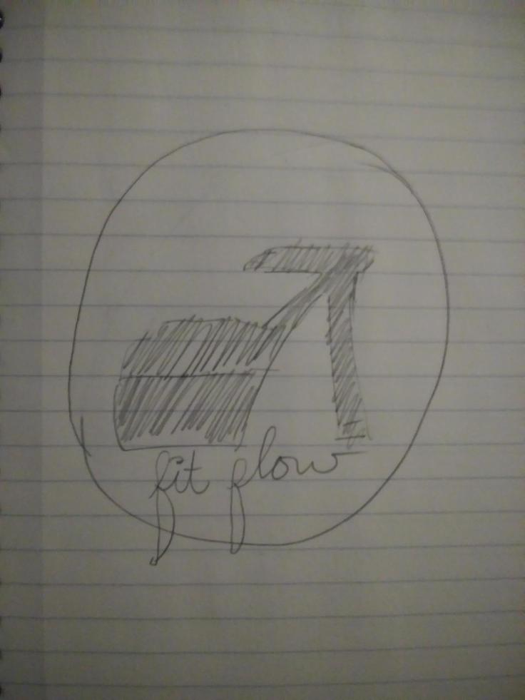
Logo Sketch

My idea for my sketch is to create an outline of a stiletto heel, create a circle around it, and then underneath have the name of my website– FitFlow.  Logo 2

Draft-LogoFor this project, I decided to create a Logo of using my stiletto pole heels. My course topic is unique styles of fitness. I pole dance, but I also teach pole dancing for UREC, and part of pole dancing can include different styles of shoes, such as sneakers, cowboy boots, stilettos, and ballet point shoes. I typically dance either barefoot or in stilettos. Past that, FitFlow is the name I chose for my website, so I felt it should be included in the logo.

My influences for my design were actually pole clothing brands. I was looking for pole clothing, and notices the logo for Dragonfly pole wear is a dragonfly, the logo for Bad Kitty is the outline of a cat, and the logo for Cleo the Hurricane is a lightning bolt. All of those brands contributes to my idea, which helped to create my idea. The significance of each element in my design was the stiletto which represented pole dancing, another unique kind of fitness, FitFlow is the name of my website, and the outside circle encapsulated the rest of the design.

I took a picture of my heel and uploaded it to my computer, then I sent it to my email so that I could download it for my logo. From there I placed the image in Illustrator, and used to pen tool to outline the stiletto and then cut out the little individual pieces in the strap on the shoe. After I adjusted the lines a little using the point selector tool to make sure the lines followed the shoe properly. Then I used the shape builder tool to remove the pieces near the strap that weren’t part of the shoe. I then created to colors in the swatch section and used them with the gradient tool to create the coloring of the shoe.

For the circle on the outside, I placed down two circles. One I filled with white and the other with black. I sized the black circle to be larger than the white circle, and then placed the white circle on top of the black circle by going to Object- Arrange- Send to Front. After they were on top of each other, I went back to the black circle and used the same colors I had chosen for the shoe to tie the two pieces there.

For the font, I used an Edwardian font style that was already preexisting on Illustrator to type FitFlow. I resized the text to be 72 pt font, and placed in inside the circle. I highlighted the text and created another color with the swatch maker to find a color I felt would pop more than black.

I encountered very few technical challenges while creating my logo. I had a little trouble remembering which tools did what, so I ended up re-watching parts of the Illustrator tutorial videos for help. My largest technical difficulty was that the Adobe Illustrator 2018 doesn’t already have the tools lined up on the side of the screen like it did in the videos. I was able to find all of the tools in under Window at the top of the screen and then drag them into the side bar as needed.


Blog at WordPress.com.

Up ↑

Design a site like this with WordPress.com
Get started